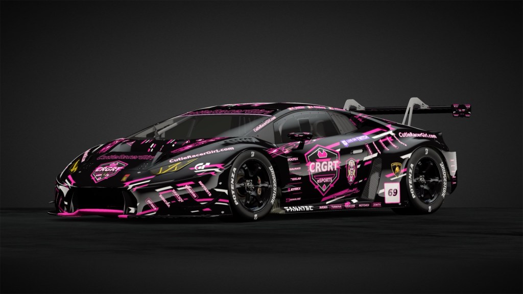
A racing team’s identity should be recognisable before you even read the name on the car.
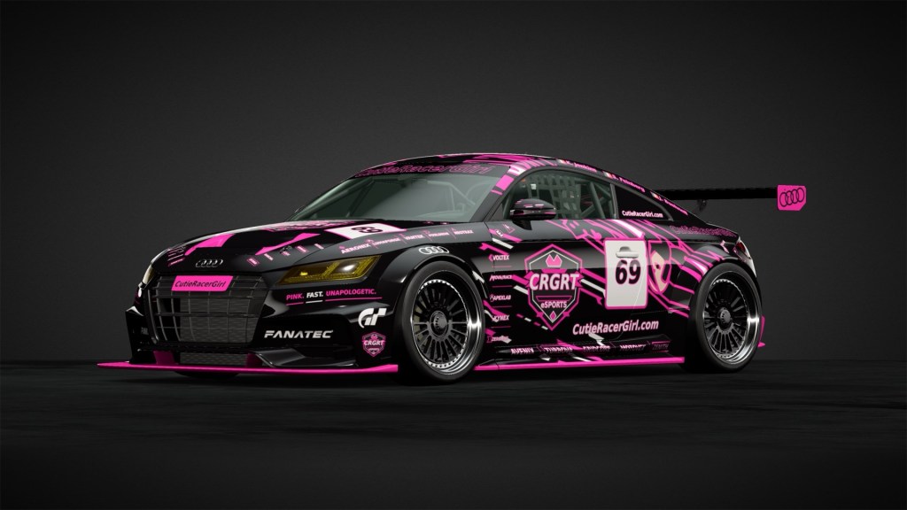
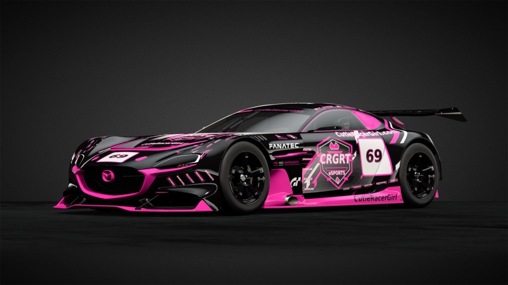
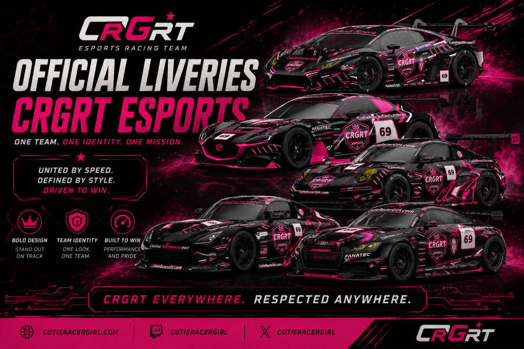
That’s exactly what we’re building with the official CRGRT Esports livery collection.
Across different manufacturers, different body shapes and very different racing machines, CRGRT cars share a visual identity built around black, neon pink, aggressive graphics and unmistakable team branding.
The cars aren’t supposed to look identical.
They’re supposed to look like they belong together.
And that’s the philosophy behind the CRGRT livery programme.
The CRGRT Look
CRGRT’s visual identity combines traditional GT racing influences with a much more modern esports and cyber-motorsport aesthetic.
Black forms the foundation.
Hot pink provides the identity.
White is used selectively for contrast.
From there, the liveries become deliberately more aggressive.
Rather than relying heavily on conventional racing stripes, CRGRT cars use sharp geometric shapes, fragmented graphics, digital patterns, slashes and sudden changes of direction across the bodywork.
The result is something we’d describe as:
Neon Motorsport. Cyber-GT. CRGRT.
It’s loud without abandoning the appearance of a serious racing car.
Black and Pink
The black-and-pink combination has become fundamental to CRGRT.
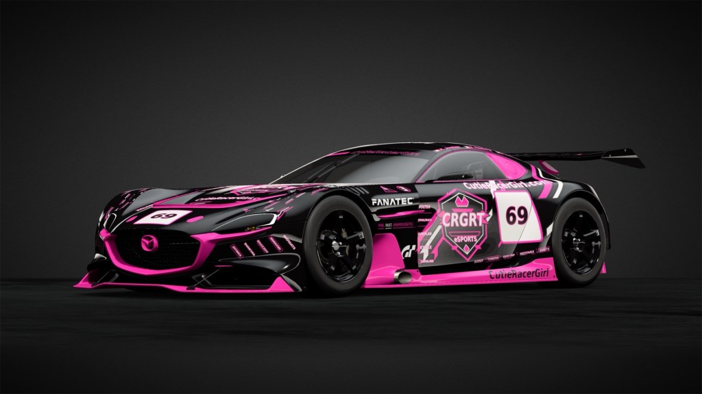
Black gives the cars a dark, purposeful base and allows details such as vents, aero components and the natural shape of the bodywork to remain prominent.
Against that background, the pink becomes impossible to ignore.
Depending on the car, it can appear as a relatively small accent or explode across entire sections of bodywork.
That’s intentional.
We don’t want the pink simply decorating the car.
It’s part of the identity of the car.
White then provides another layer of contrast, particularly around number panels, logos and smaller graphics.
The three colours together mean that even when the actual design changes dramatically between models, the CRGRT identity remains immediately recognisable.
One Identity Without One Template
One of the most important principles behind the CRGRT liveries is that we’re not simply copying and pasting one design onto every vehicle.
Every racing car has different proportions.
A Lamborghini doesn’t have the same visual language as a Porsche.
A Mazda doesn’t have the same body shape as a Dodge Viper.
And an Audi doesn’t need to wear its graphics in exactly the same way as any of them.
Instead, each livery is designed around the shape and character of the individual car.
The positioning and direction of the graphics can change.
The amount of pink can change.
Sponsor placement can change.
Some designs can be relatively clean and geometric, while others can become considerably more chaotic.
What remains consistent is the CRGRT design language.
That gives every car individuality without sacrificing the team identity.
The CRGRT Shield
One of the strongest recurring elements is the large CRGRT Esports shield.

Rather than treating the team logo as another tiny sponsor sticker, the shield becomes a major component of the livery itself.
It’s deliberately prominent.
On many of our cars, the shield dominates the door or central side section, surrounded by the pink-and-black graphics that define the rest of the design.
From screenshots, broadcasts or replays, the objective is simple:
You should know it’s a CRGRT car.
#69
The number 69 is another recurring visual element throughout the current collection.
The white-and-pink number panels provide a strong contrast against the predominantly black bodywork and help connect cars that otherwise have completely different silhouettes.
Combined with the shield, colour palette and graphic language, it becomes another part of the team’s visual signature.
Controlled Chaos
There’s a lot happening on a CRGRT livery.
That’s deliberate too.
Small sponsor-style graphics, technical markings, fragmented lines and micro-details fill areas around the wheel arches, side skirts, bumpers and quarter panels.
Viewed closely, there’s plenty to discover.
Viewed from a distance, those details merge together into the larger black-and-pink design.
The trick is making something visually busy without making it completely incoherent.
We call it controlled chaos.
The large graphics establish the overall shape.
The smaller graphics provide texture.
And the major CRGRT branding gives everything a visual anchor.
Different Cars, Different Personalities
The current CRGRT collection demonstrates just how flexible that design language can be.
Lamborghini
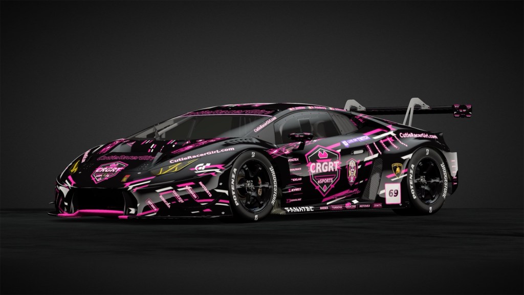
The Lamborghini interpretation is arguably one of the wildest.
Its naturally dramatic shape suits the fragmented pink graphics particularly well. There are graphics seemingly attacking the bodywork from almost every direction, giving the car an unmistakably esports-inspired appearance.
It’s loud, complicated and deliberately excessive.
Exactly as a Lamborghini probably should be.
Mazda
The Mazda takes the same basic identity in a slightly different direction.
Its smoother body shape allows larger blocks of pink, black and white to work together, while the huge CRGRT shield provides the visual centre of the car.
It demonstrates that CRGRT doesn’t require every car to be covered in identical graphics to remain recognisable.
Porsche
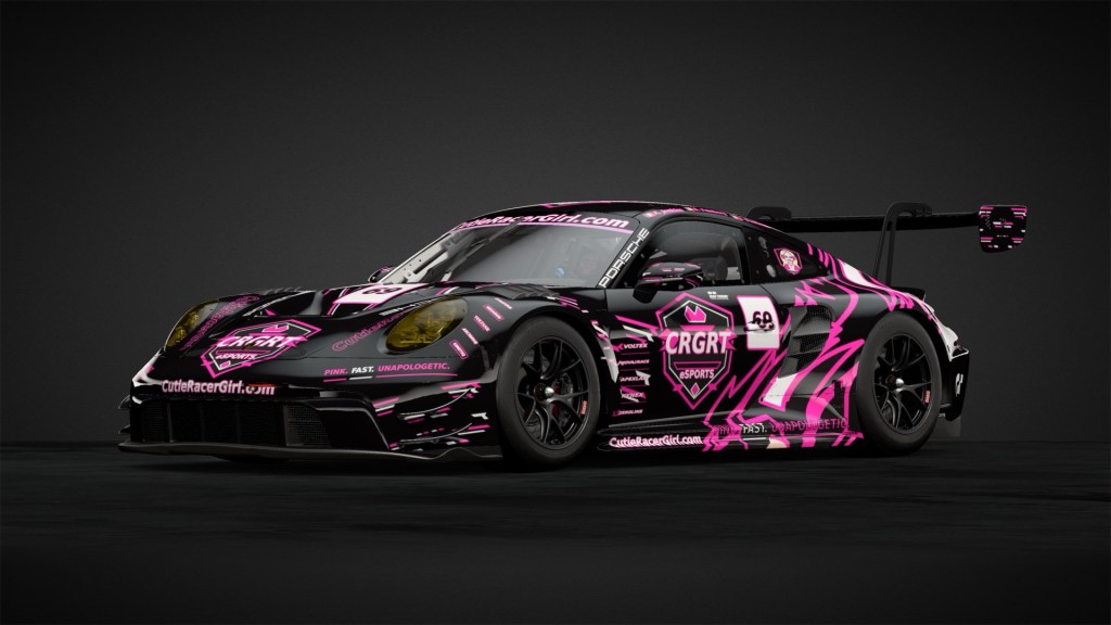
The Porsche pushes the side graphics particularly hard.
The huge pink design stretching across the doors and rear quarter transforms the traditional GT silhouette into something much more unmistakably CRGRT.
It’s one of the clearest examples of allowing the underlying car to influence the livery rather than forcing the livery onto the car.
Dodge Viper
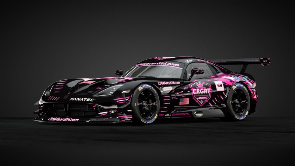
The Viper naturally has enormous visual presence.
The CRGRT treatment complements that rather than fighting it.
The long bonnet remains intimidating, while the black base, pink highlights, large team shield and racing-number treatment give it the appearance of a genuine team GT machine.
It’s arguably the most traditionally aggressive motorsport-looking member of the current collection.
Audi
The Audi interpretation brings the identity onto a more compact platform.
Here, the combination of black bodywork, bright pink detailing, large CRGRT branding and dense sponsor-style graphics gives the car an almost touring-car/tuner crossover aesthetic.
Different proportions.
Same family.
Built for Screenshots and Racing
There’s another consideration behind these designs: Gran Turismo is visual.
Players don’t spend every race examining another car from two metres away.
They see cars flashing past.
They see them in mirrors.
They see them during replays.
They see screenshots and social-media posts.
A successful esports livery therefore needs to work at multiple distances.
That’s why the CRGRT shield is large.
That’s why the pink is so bright.
That’s why the major graphics are deliberately bold.
The tiny details reward close inspection, but the overall identity needs to survive when the car occupies only a small part of the screen.
More Than Decoration
A team livery isn’t just there to make a racing car prettier.
It creates identity.
When several CRGRT drivers enter a race using different manufacturers, we want there to be an immediate visual connection between them.
The cars might handle completely differently.
Their drivers might have completely different driving styles.
Their silhouettes might have almost nothing in common.
But visually, they’re teammates.
That’s what a strong racing identity should achieve.
Pink. Fast. Unapologetic.
The phrase “PINK. FAST. UNAPOLOGETIC.” probably summarises the design philosophy better than anything else.
CRGRT isn’t trying to hide its identity behind conservative motorsport graphics.
The cars are supposed to stand out.
They’re supposed to look aggressive.
They’re supposed to be immediately recognisable.
And, most importantly, they’re supposed to look like they belong on a racing grid.
The CRGRT Grid Is Growing
These liveries represent only part of the developing CRGRT Esports collection.
As additional cars and drivers become part of the programme, the challenge will remain the same:
Preserve the identity without making every car identical.
Different manufacturers.
Different machines.
Different drivers.
One visual language.
When a black racing car covered in neon-pink graphics appears in the mirrors, we want drivers to recognise what they’re looking at before they can even read the badge.
One team. One identity. One mission.
These are the colours of CRGRT Esports.


Leave a Reply